END TO END
BRANDING
& PACKAGING
A decade of culinary innovation
Fresh As required a creative partner who could match their pioneering spirit in the freeze-dried ingredient sector. Over a partnership spanning fifteen years, Titanium Creative has worked to transform a niche technical process into a premium, world-renowned brand. Our objective has been to ensure that every touchpoint reflects the intense flavor, vibrant color, and high-end quality that Fresh As provides to both professional chefs and home cooks globally.

"Working with Titanium Design on the Fresh As brand was an outstanding experience. As a premium food producer, it was important for us that every aspect of our brand communicated quality, innovation, and a clear design language. Titanium Design played a key role in shaping that vision and translating it into a cohesive and compelling brand.
Their work covered the full scope of the Fresh As brand experience — from the core branding and design language through to product packaging, web design, point-of-sale materials, and exhibition stand design. The team demonstrated a strong ability to understand both the product and the market, creating designs that felt premium, modern, and instantly recognisable.
What impressed us most was how effectively their work connected with the market. The response to Fresh As was immediate, with strong adoption and engagement across multiple segments. The brand stood out clearly in a competitive space and helped position Fresh As as an innovative leader within the category.
Titanium Design were collaborative, thoughtful, and highly professional throughout the process. We would gladly work with them again and strongly recommend them to any business looking to build a powerful and distinctive brand."
Garry Short
Client: Fresh As
Agency: Titanium
Project: End-to-End Brand Architecture & Global Packaging Strategy
Capabilities: Brand Identity, Packaging Design, Photography, Web Design, Exhibition Design, Brochures, Catalogues
Timeline: 2011 - 2025...
Crafting a premium visual sensory experience
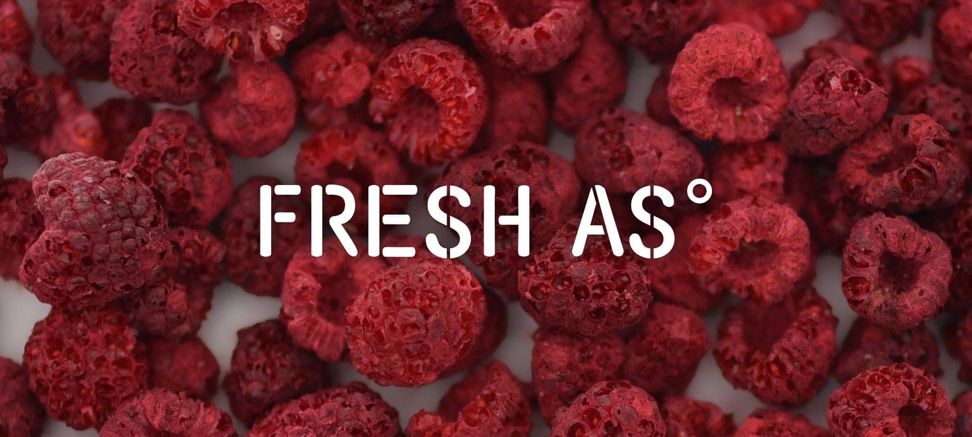
The challenge was to communicate the "freshness" of a dry product through visual cues alone. Titanium Creative led the development of a sophisticated packaging system that prioritises high-impact product photography and clean, minimalist typography. This visual language highlights the natural integrity of the fruit and ingredients, allowing the product to stand out on crowded retail shelves while maintaining the professional authority required for the wholesale culinary market.
Mastering the art of product presentation
Acting as a dedicated extension of the Fresh As team, we managed the comprehensive rollout of their brand assets. From art-directing specialised macro-photography that captures the unique texture of freeze-dried products to designing immersive trade show displays, we bridged the gap between industrial production and artisanal appeal. By developing cohesive websites, brochures, and sales collateral, we provided the brand with a consistent voice that resonates in kitchens from Auckland to New York and beyond.

Scaling for the global marketplace
The result of this long-term collaboration is a robust brand ecosystem that has supported the expansion of Fresh As into diverse international markets. Whether through large-scale environmental signage or the tactile experience of premium retail pouches, the brand identity remains unmistakably vibrant and premium. This strategic alignment has given Fresh As the agility to rapidly launch new product lines—from powders to whole fruits—while maintaining a unified and recognizable presence worldwide.
A legacy
of quality
Through ten years of collaborative evolution, Titanium has delivered a scalable foundation that adapts to changing food trends and retail requirements. This enduring partnership has built a visual legacy for Fresh As, ensuring that as they continue to innovate with new ingredients, their brand remains the gold standard for freeze-dried excellence in the global food industry.